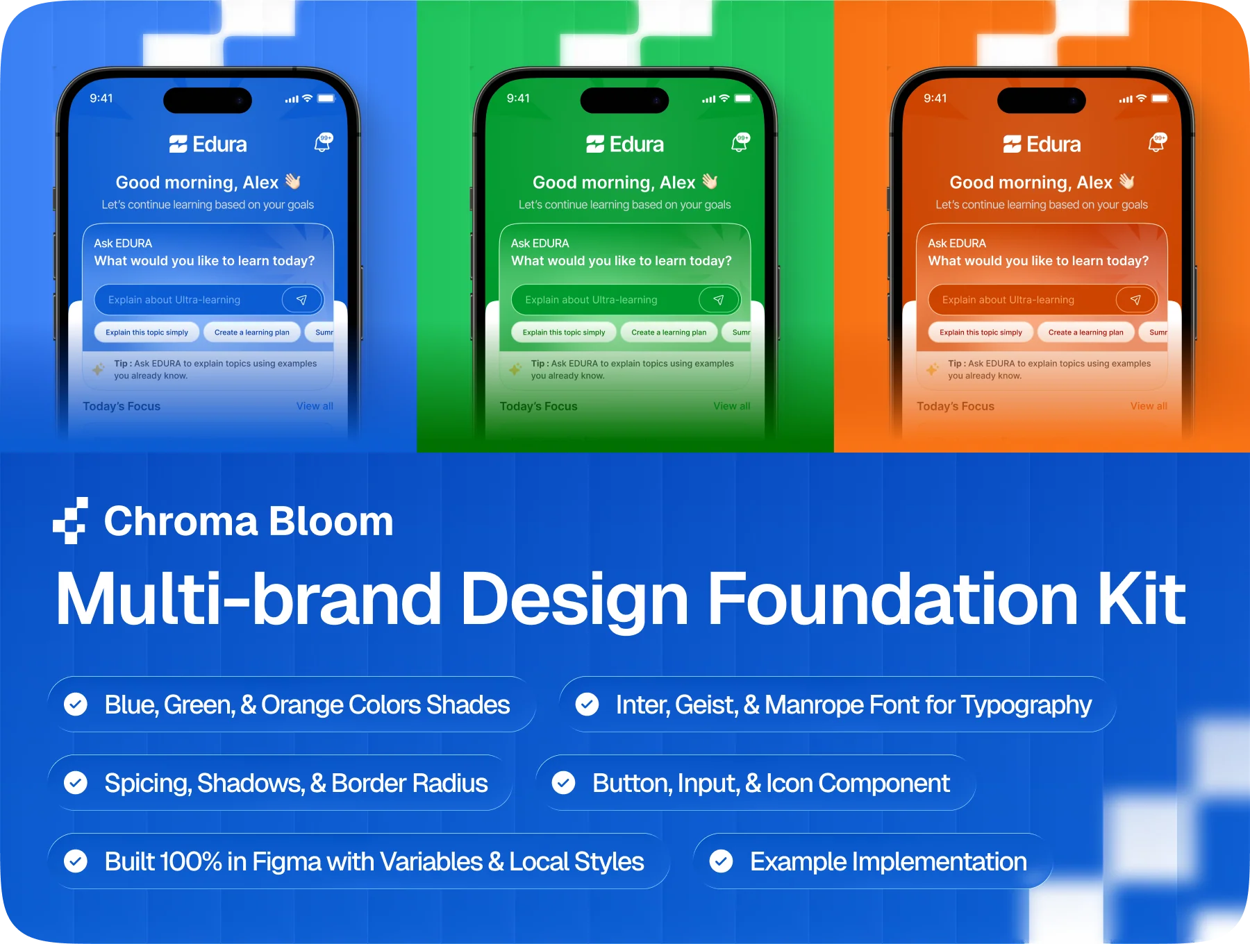
Chroma Bloom — Multi-brand Design Foundation Kit
Switch brands and modes in seconds.
Get any file from UI8
All downloaded files are stored in your personal Telegram bot
Release date04/07/2026
AuthorHumantest Design
TypePresentations
Highlights
🎨 3 Unique Brand Color Schemes
🔤 3 Font Style Choices
📐 Layout Spacing, Corners & Depth
🧩 Prebuilt Components Ready to Use
Get any file from UI8
All downloaded files are stored in your personal Telegram bot
Release date04/07/2026
AuthorHumantest Design
TypePresentations
Highlights
🎨 3 Unique Brand Color Schemes
🔤 3 Font Style Choices
📐 Layout Spacing, Corners & Depth
🧩 Prebuilt Components Ready to Use
Overview
Chroma Bloom is a production-ready Figma foundation kit for multi-brand apps and client work. It includes 3 tokenized brand palettes, 3 font systems with 16-step scales, spacing, radius, shadow tokens, plus Button, Input, and Icon components. Variables enable fast brand switching, while Color and Text Styles support all workflows. Figma Pro needed for Variables.
Presentations
Impress your audience with stunning presentation templates and slides